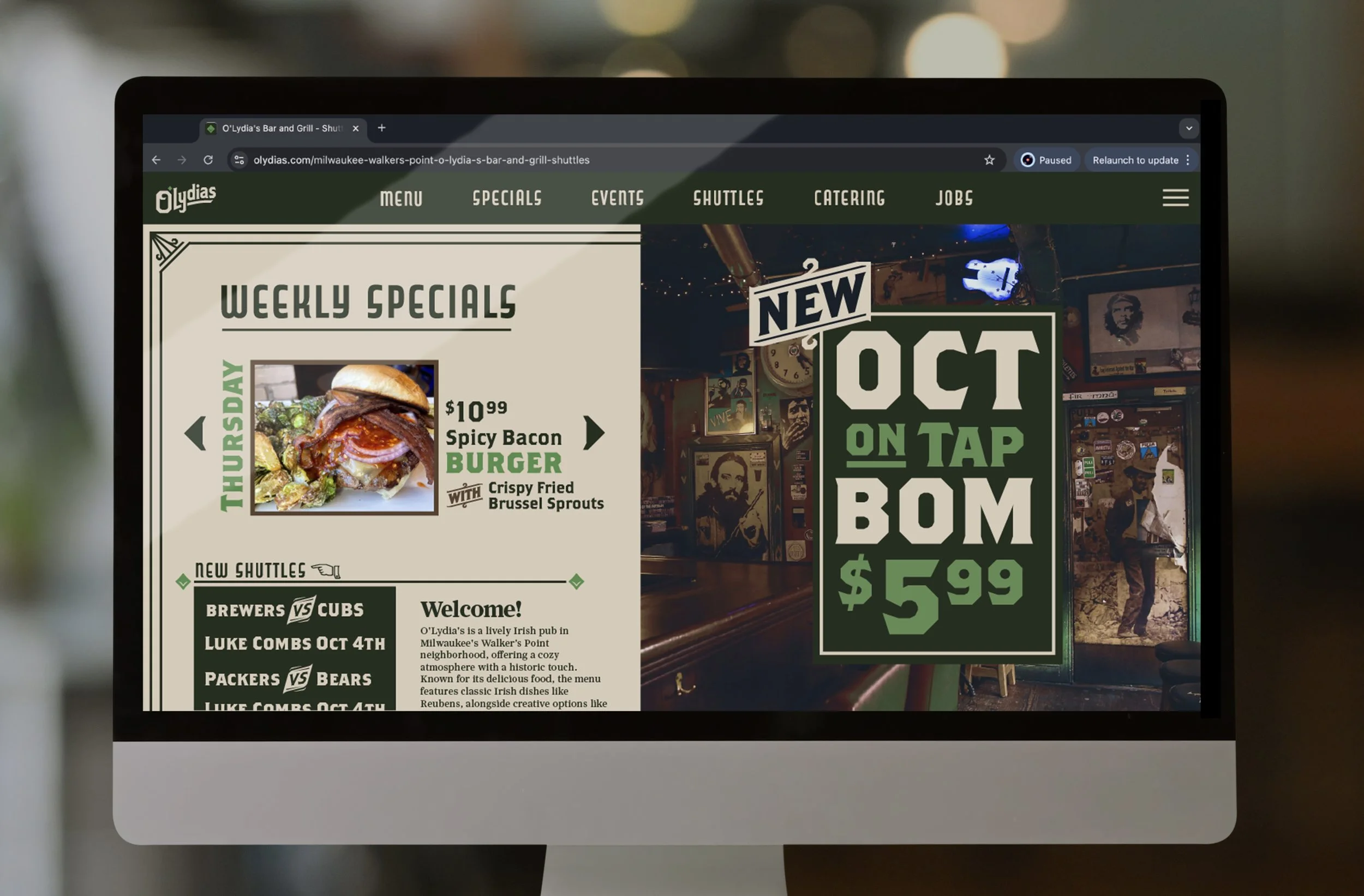
O’Lydia’s Rebrand
For my Identity Design course, I took an existing brand and create a whole new identity system around it
Concepting
I wanted to create a logo that captured the essence of what O’Lydia’s is, while ensuring that it looks good in this yellowish warm light that is common with bars.
I wanted the colors to feel older & more muted to match the target audience while also maintaining it’s celtic origin.
Preliminary Sketching
During sketching, I ensured to keep in mind the “traditional” aspect of logo making.
Focusing more on the letterforms, serifs, & emblems marks to maintain an old style, Celtic feel while not being so obvious with the clover
Original Identity Mark for O’Lydia’s
Rebranded: Identity Mark for O’Lydia’s


